My New Island Life
[Dev Blog] Shaders & Map Repaint
Intro
Greetings,
As the title indicates, in this post I’ll show you exactly what I meant about my struggle with shaders on imported models, plus one other upgrade you’ve probably already guessed. While preparing the post, I made enough screenshots to publish a short VN, so I decided to merge them into single images to prevent an endless wall of pictures and make the differences pop. Although, the post still turned out to be way longer than I expected.
Shaders
Let's get right into the shaders first.
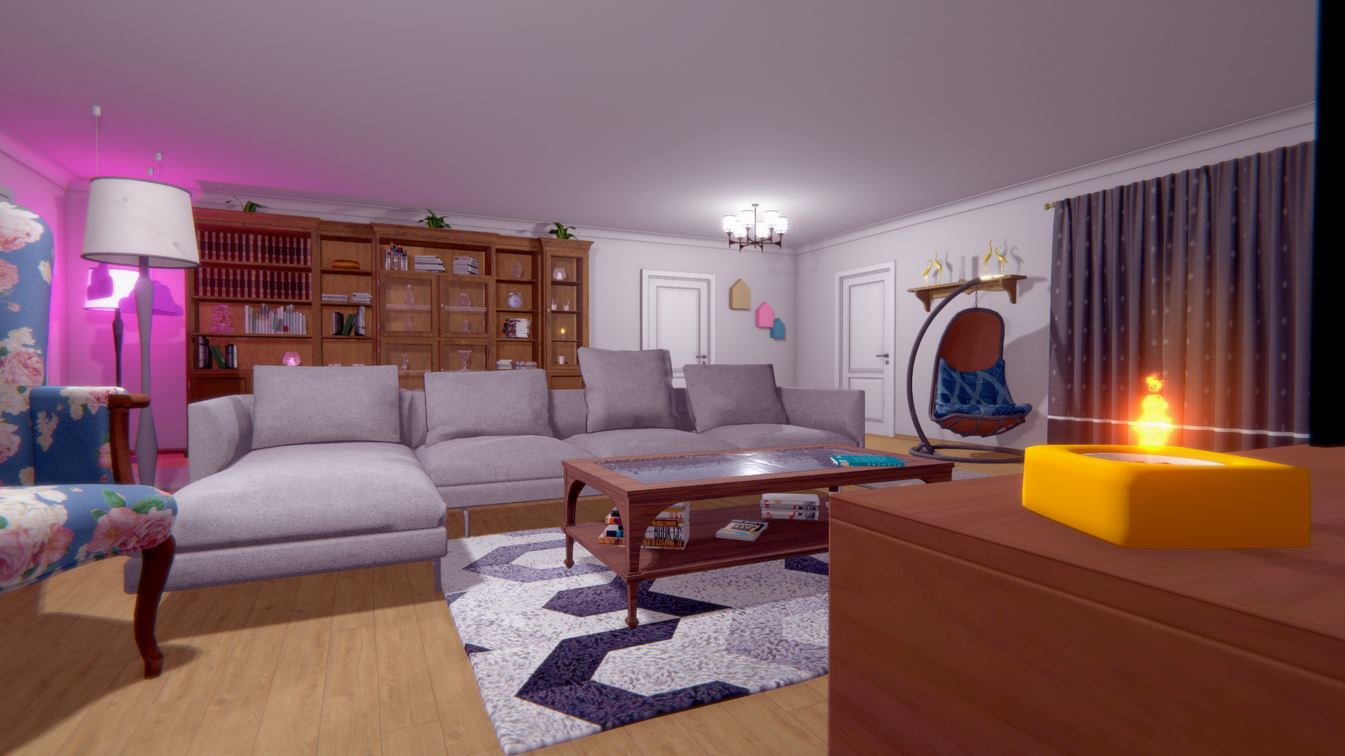
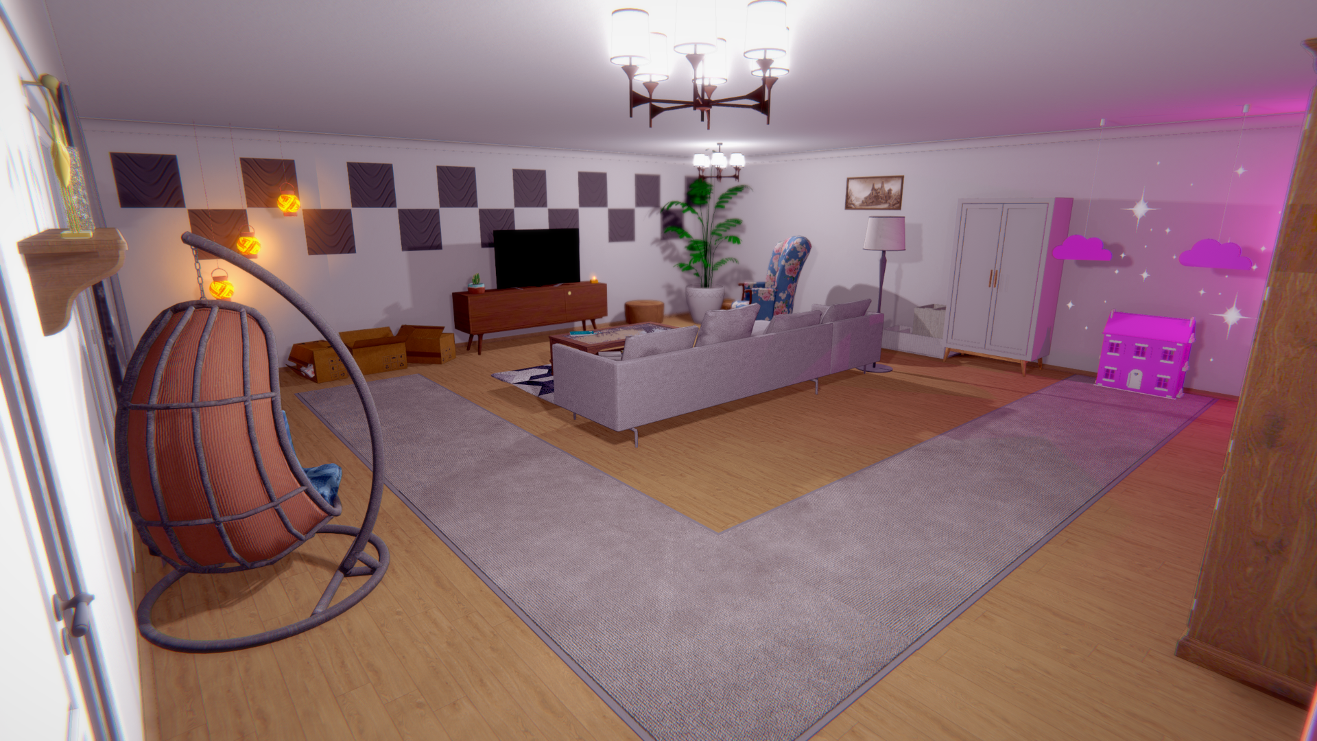
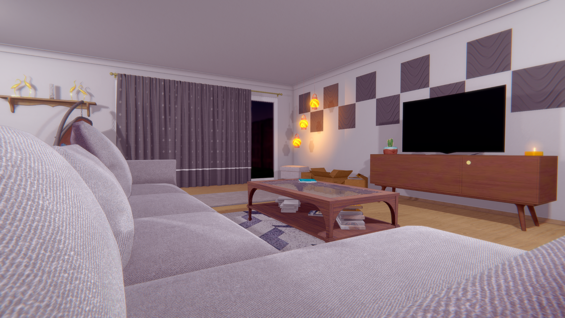
When I started importing my own custom models and textures for the living room, it became clear they were in a fistfight with the default shaders. No amount of fiddling with the material editor sliders could fix the core issue: everything looked flat, dark, and super crispy.
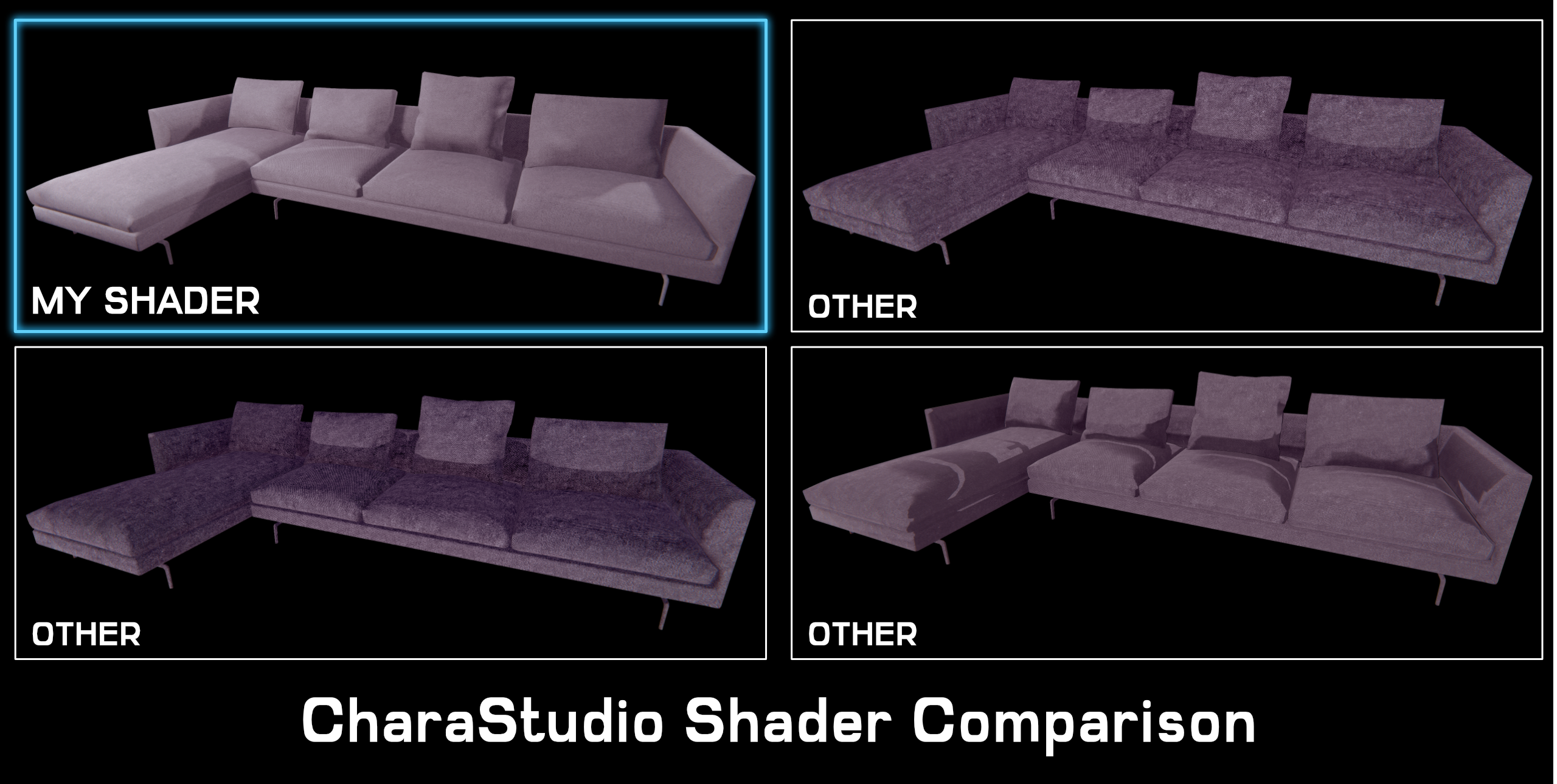
Now, to be clear, the default shaders aren't trash. The Shrine area is proof that you can build beautiful scenes with them, but that was made with assets designed to work perfectly within the editor. My custom assets were a different story. The most glaring problem was a bizarre bug where gray textures would get a weird reddish tint. After researching the issue, I found it's because of a color space or gamma correction conflict, and it's a massive headache to fix without direct shader access.
But that reddish tint was just a symptom of a much bigger flaw I discovered while lighting the living room. It turns out, nearly every shader I tested had a hard-coded limit. An object can only be affected by three light sources at once.
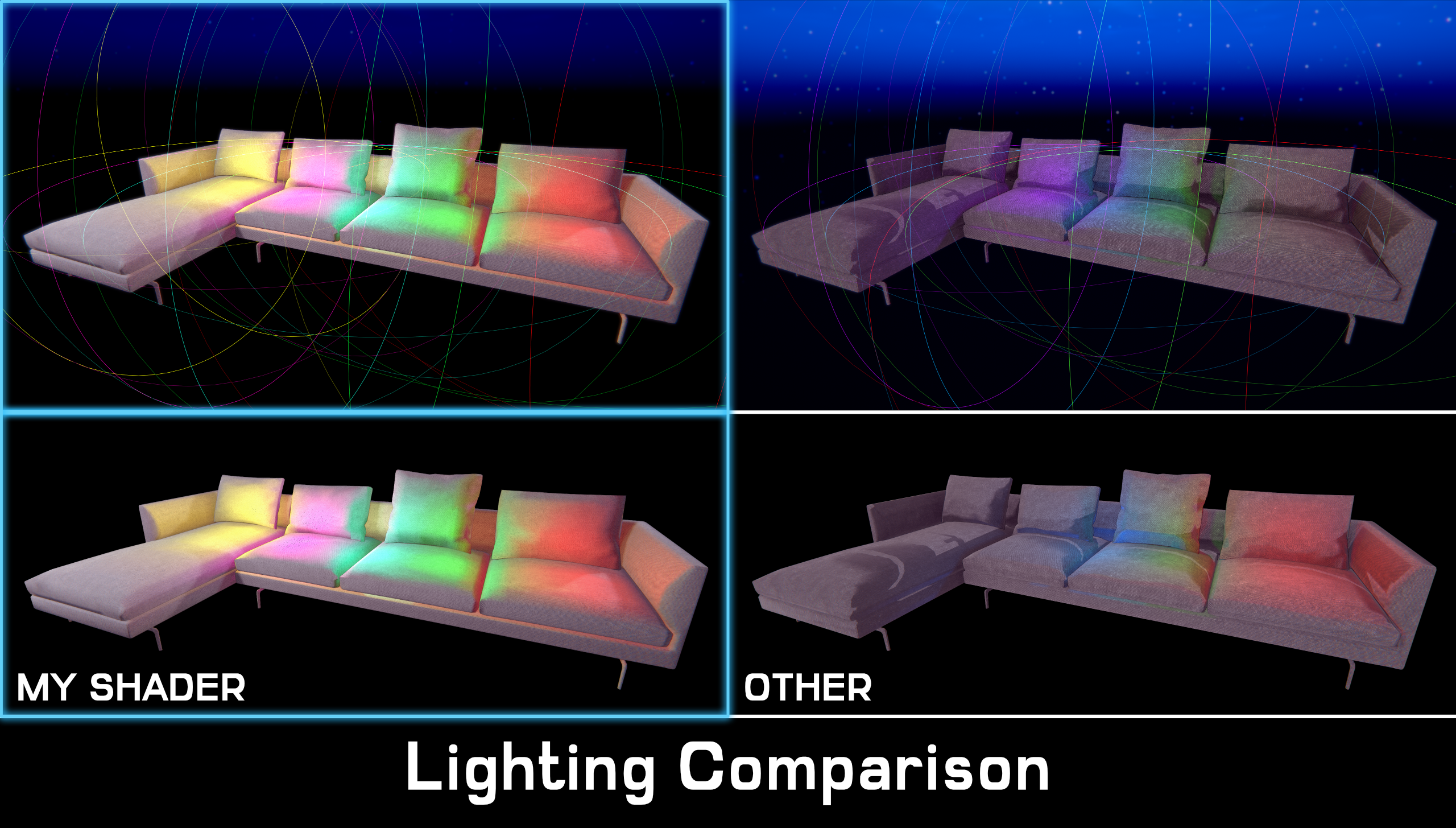
A fourth light? It simply gets ignored. Vanishes. Doesn't exist.
This limit is a huge nerf to graphical fidelity, especially for indoor scenes. An outdoor area like the Shrine is simple; you have the ambient light from the sky and maybe a couple of lamps. But an interior can have dozens of overlapping lights. A three-light limit per model just wasn't going to cut it. It was a creative bottleneck that would make complex, atmospheric scenes impossible.
To add insult to injury, I hit another hard-coded ceiling. The lights hitting my shader have an intensity of 1.5. In an attempt to compensate on the other shader, I almost doubled the scene exposure, cranked its lights up to 2.0, and then even higher. Nothing changed. In order to brighten the sofa, I'd have to increase the overall exposure. The brightness produced by lights was clearly capped. At that point, it doesn't matter if there's some secret checkbox fixing it. When you hit one wall after another, you eventually start hitting them back. Literally.
That was the final nail in the coffin. The only way forward was to build my own shader from the ground up.
The Result: My Custom Shader
So, after all that complaining, what does the solution actually look like?
Here, it’s the control panel for the beast I built to solve all the problems I just laid out.
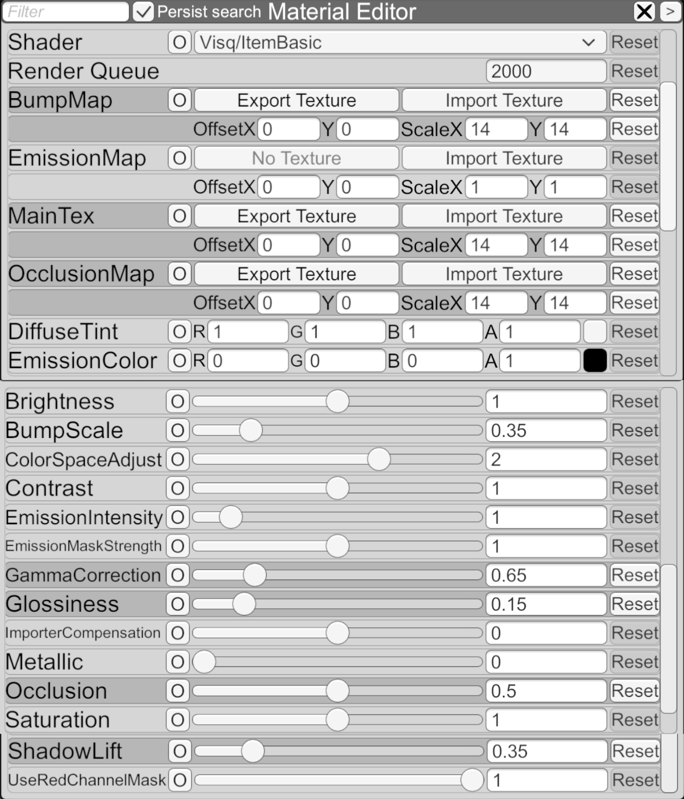
This isn't some all-in-one, jack-of-all-trades shader. You'll notice it doesn't have a bunch of exotic, performance-hungry features like tessellation or complex refractions. This is a specialized tool to solve the exact problems I was facing with color and lighting on my models.
I won't be going through each slider, so don't worry. I'll talk only about the most important ones.
- Gamma Correction & Color Space Adjust: These two work together to let me manually correct the color profile of a texture. If an imported model has that weird reddish tint on its grays, I can use these sliders to dial it back and restore the intended color. It's a targeted fix for the engine's color space conflicts.
- Importer Compensation: This is a simple but powerful tool for fixing translation errors. Sometimes, a 3D model, even with a pure white texture, just looks off when you drop it into the engine. It might appear slightly too dark or washed out. This is usually caused by hidden data in the model file itself, like default vertex colors being set to gray instead of white, which darkens the whole object.
- Shadow Lift: This is my favorite one. Instead of just cranking up the overall brightness and washing everything out, this specifically targets and brightens the darkest parts of the texture. It lets me pull details out of the shadows without ruining the scene's contrast.
I've also built out variations of this shader for things like foliage and glass, but they're all based on these same core principles, so I won't bore you with the minute details.
Shaders In Action
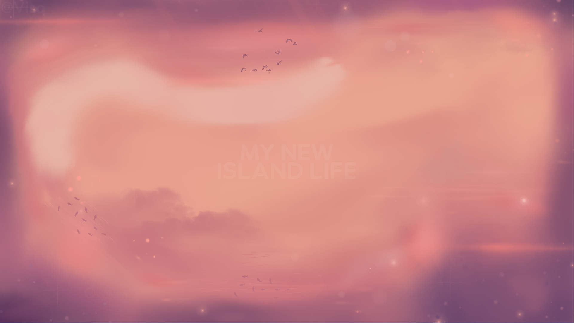
Here are some shots of the living room using my new shaders. Now, one thought that's been nagging at me is the style. This is an anime-styled visual novel, but the environment is leaning more towards realism, lacking that hand-crafted, stylized look. The masochist in me wanted to fire up Substance Designer and create custom textures, but it's been a while since I last used it, and frankly, it's also been a while since the last novel update. Hence, I made the call to prioritize delivering these new systems over disappearing for another month on texture work.
Shaders Arc. End.
The Map Had to Die
Alright, let's talk about the other upgrade. After spending weeks staring at color values and perfecting shading, my eyes became finely tuned to detect visual garbage. And the old island map was screaming at me.
Let's not beat around the bush: the old map looked like crap. It was a placeholder that somehow became a permanent resident. Now, my comfort zone is in code and math, not on a drawing tablet, but the daily psychic damage from that old map was enough to make me step up. It had to go.
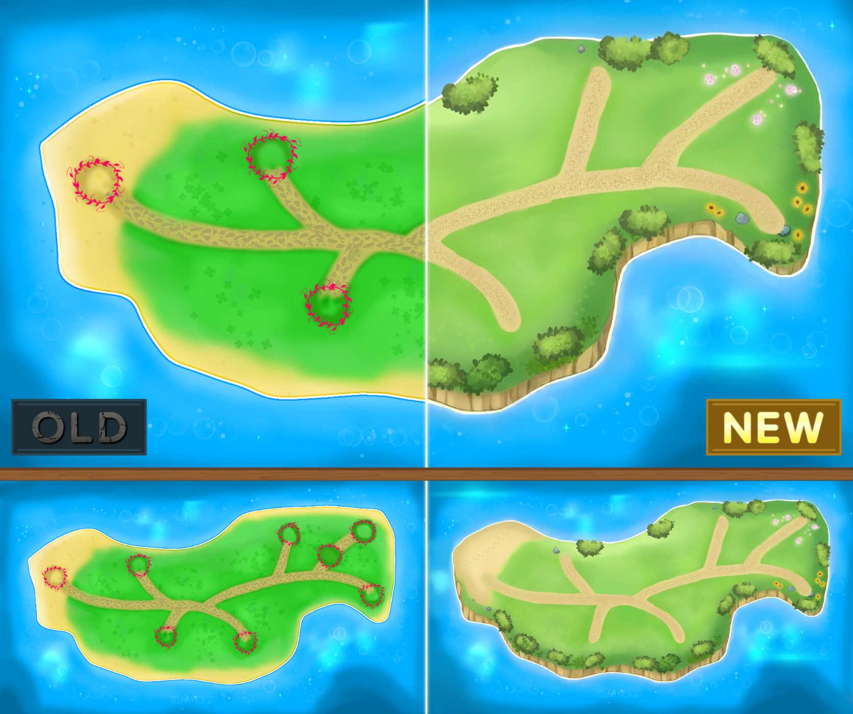
Here's the before-and-after. The new map is hand-painted from scratch (except the ocean, I like it) following the old island shape. It has texture, a cohesive art style, and it actually looks like an actual island, not a biohazard zone.
Rookie Mistake
Here's where it gets funny. The process of painting the new map was going great. I was in the zone, really enjoying myself, and after the main "Midday" version was done, I got ambitious. "I'll just do a quick repaint for an Evening and Night version," I thought. "How hard can it be?"
I fired up Krita, all excited about a quick win, and immediately came face-to-face with my own special brand of genius.
While painting, I had started out so organized: a layer for the bushes, a layer for the cliffs, everything neat and tidy. And then, at some point, my brain must have just packed up and left. I had merged the grass, the sand, the paths, the details, and everything else into one, single, gigantic layer of pain.
Thankfully, the god-tier color grading tools in DaVinci Resolve managed to salvage the landmass. I could twist the colors enough to create the other time-of-day versions. The water, however, refused to cooperate. No amount of grading trickery could make it look right. There was no other choice: I had to go back and repaint the entire ocean from scratch for each new version.

With the new oceans painted, it was time for the final, delicate surgery: merging the salvaged landmass with the water without ruining everything.
My weapon of choice for this task was, again, my trusty partner, DaVinci Resolve. Yes, it's a video editor. But when you know a tool's compositing suite like the back of your hand, you can make it do pretty much anything.
Before I show you the final maps, I want to properly honor the work that went into them. This wasn't just a simple copy-paste. This was a complex color-grading and compositing process.
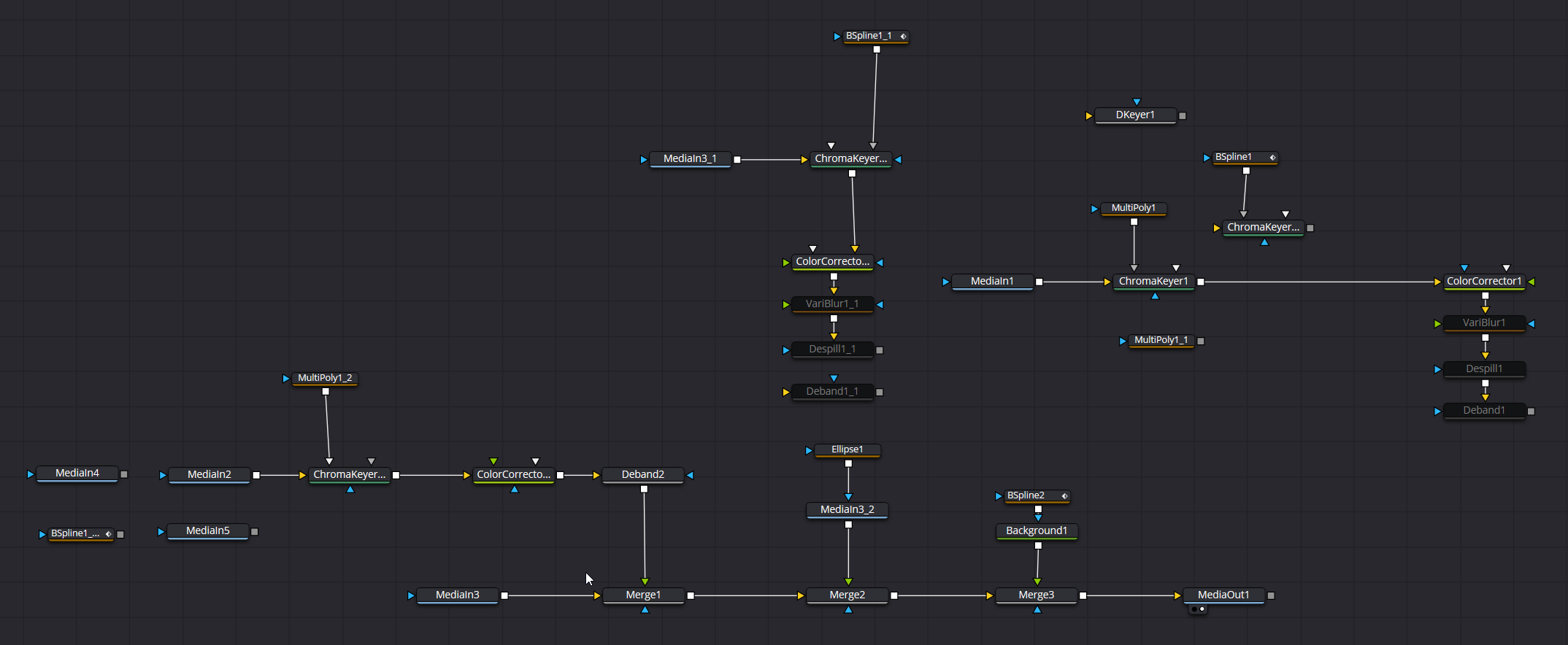
This is what that process looks like. Some parts are disconnected and disabled, because they were used for other map.
Every one of those boxes and wires represents a specific, targeted operation, like: isolating the grass, adjusting the hue of the sand, keying out specific colors to replace them, adding subtle blurs and debanding to make it all sit together perfectly.
This is the effort it took to rescue my single-layer mistake and blend the island seamlessly into its new home.
Here's the final result.
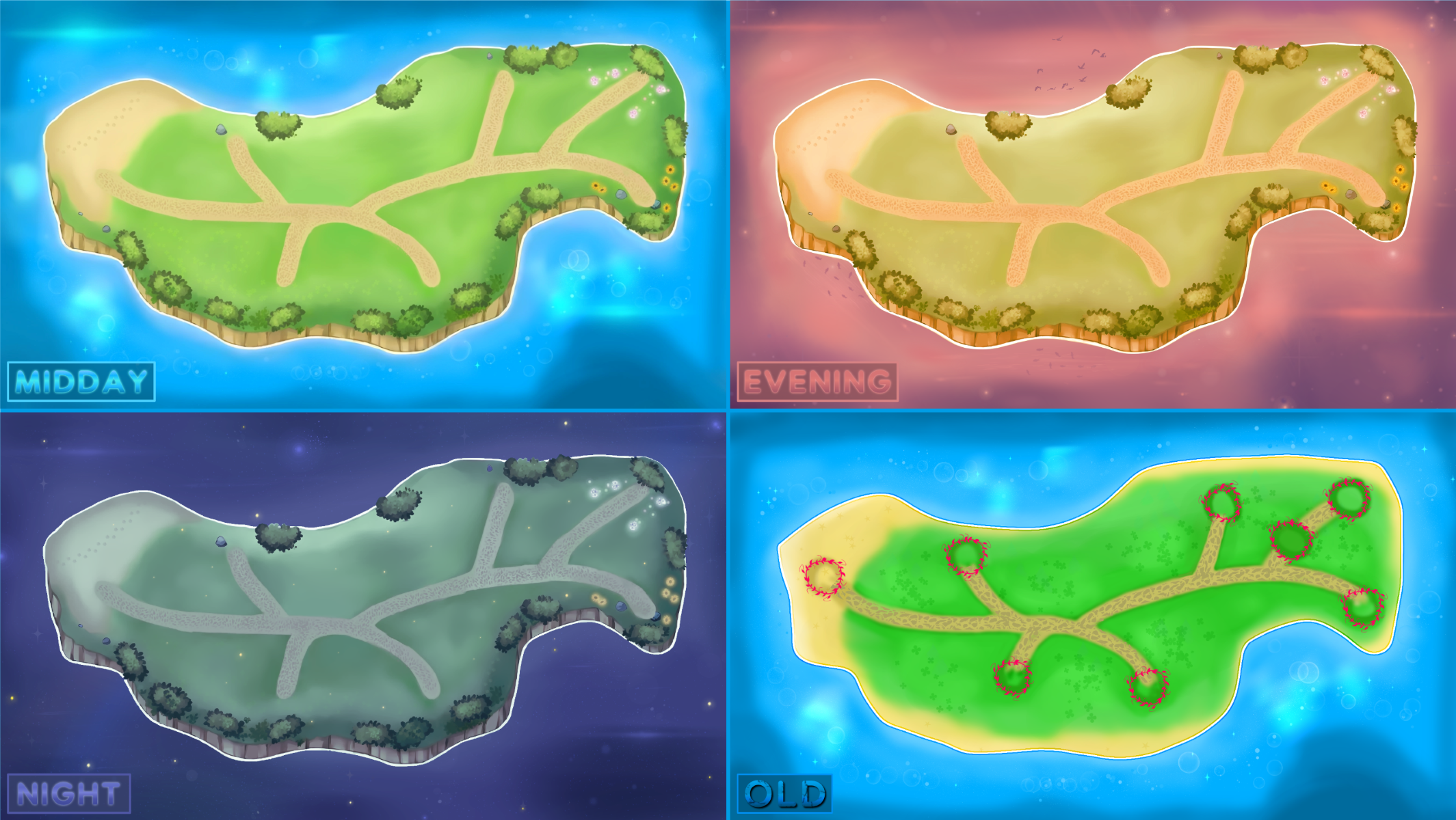
Could the paths use another hour of sharpening work? Probably. Am I going to do it? Not anytime soon.
What's Coming Next
And that’s the grand tour of the visual overhaul. This is a huge step toward the level of quality I'm aiming for with this project, and a groundwork for the next, story-driven one.
For the next dev post, we're leaving most of the technical talk behind. It’s time for you to officially meet the second new girl joining the cast. We'll also take a closer look at the designs for the new minigames that absolutely nobody asked for, but which I built anyway (complete with some ridiculously over-engineered UI).
Thank you for supporting this project.
Cheers,
Visq.


Leave a comment
Log in with itch.io to leave a comment.